ScaleSMM – Digital Marketing
I was responsible for designing the landing page from scratch starting with research, wireframes, visual identity, and finally delivering a high-fidelity, conversion-focused design.
Client Mission
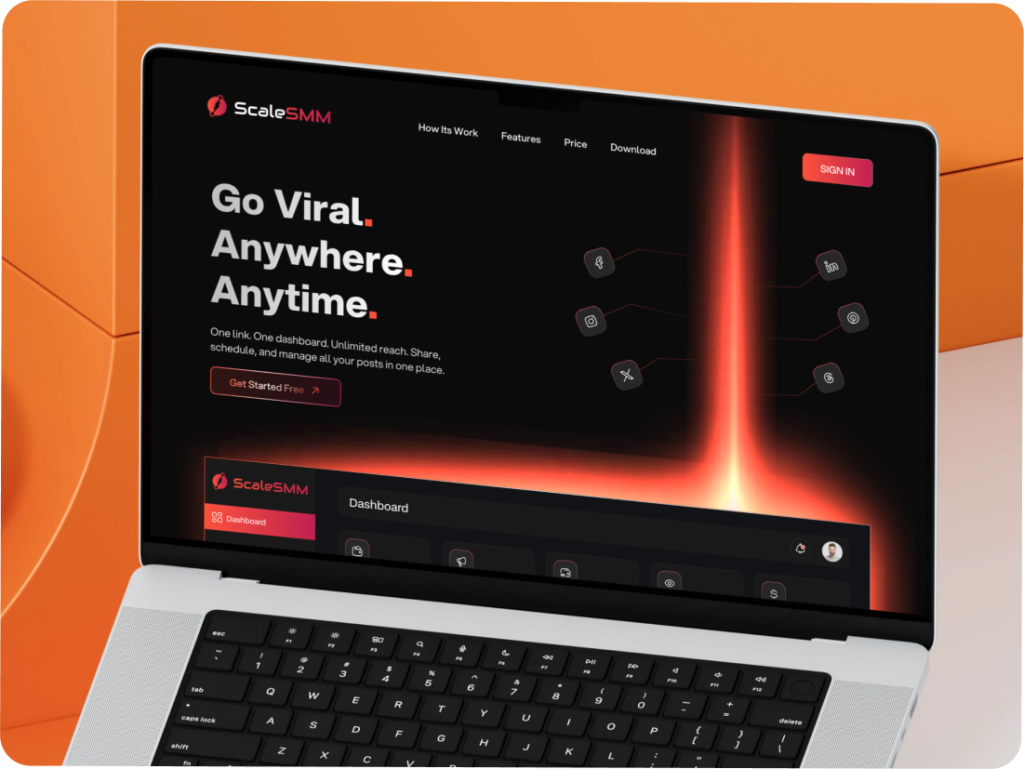
📌 Complex Market Messaging
📌 Low Conversion on Existing Pages
📌 Unclear Feature Highlighting
📌 Weak Visual Identity

🎯 Clear Value Proposition
🎯 Feature Highlights with Visuals
🎯 Strong & Visible CTAs
🎯 Modern & Trustworthy Design
🎯 Social Proof Section
✦ Discovery & Research
⟢ Analyzed competitor tools like Hootsuite, Buffer, and Later to identify design gaps.
⟢ Studied user behavior patterns for SaaS landing pages to focus on simplicity and conversions.
✦ Information Architecture
⟢ Planned a smooth page flow: Hero → Features → Benefits → Social Proof → Pricing → CTA.
⟢ Prioritized scannability with clear sections and minimal distractions.
✦ Wireframing
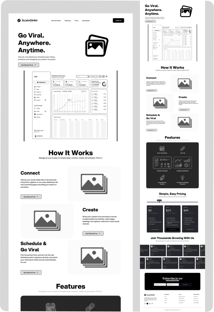
⟢ Created low-fidelity wireframes to structure the layout and CTA placements.
⟢ Iterated designs after feedback to refine messaging hierarchy.
✦ High-Fidelity Design
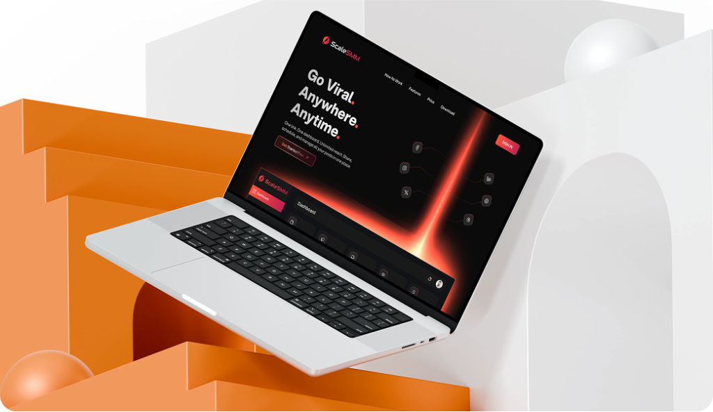
⟢ Developed polished UI screens with modern visuals, clean typography, and consistent color usage.
⟢ SIncorporated illustrations and icons to make features easy to digest.
✦ Testing & Refinement
⟢ Conducted A/B testing for CTA button placements and hero messaging.
⟢ Improved final layout for better readability and stronger conversions.
Information Architecture & Flow of Swish Screens
From Ideas to User Experience Designs
✦ Sketched low-fidelity wireframes to outline the page flow: Hero → Features → Benefits → Pricing → CTA.
✦ Focused on CTA placement, feature hierarchy, and readability.
✦ Converted into mid-fidelity wireframes for layout testing.
✦ Iterated after feedback to refine clarity and improve conversion flow.
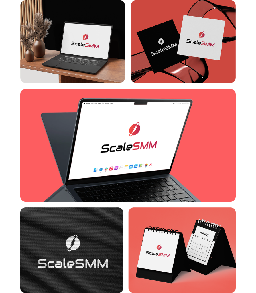
Minimal Yet Bold Identity for ScaleSMM
ScaleSMM brand identity communicates power, speed, and growth in the digital space.
✦ Logo Symbol
The circular icon with a bold lightning bolt represents energy, efficiency, and instant action, perfectly aligned with the platform’s promise of fast and simplified social media management.
✦ Typography
The futuristic, rounded font conveys modernity and innovation, while keeping readability intact for digital use.
✦ Color
⟢ Portland Orange → Represents energy, creativity, and visibility, catching attention instantly.
⟢ Bright Maroon → Adds strength, reliability, and trust, balancing creativity with professionalism.
⟢ Gradient Blend → Symbolizes growth and scalability, visually connecting energy with depth.
⟢ Dark Theme → Enhances focus, contrast, and premium feel, making the visuals bold and powerful.
✦ Feel
The identity is dynamic, professional, and scalable, making ScaleSMM memorable as a tool that empowers businesses and creators to take control of their online presence.
Final UI Design
ScaleSMM finally feels alive

David Malan
Co-Founder of ScaleSMM

Billionaire Club – NFT
Website Design
Here to Help 🪶 Innovative Ideas 🪶 Creative Concepts 🪶 Dynamic Layouts 🪶 Ready to Create 🪶 Your Trusted Solo Designer
Let's👋 Work Together
Let's Talk


