


Juffy Croze
Founder of Pedal Ride


Mobile App

Website

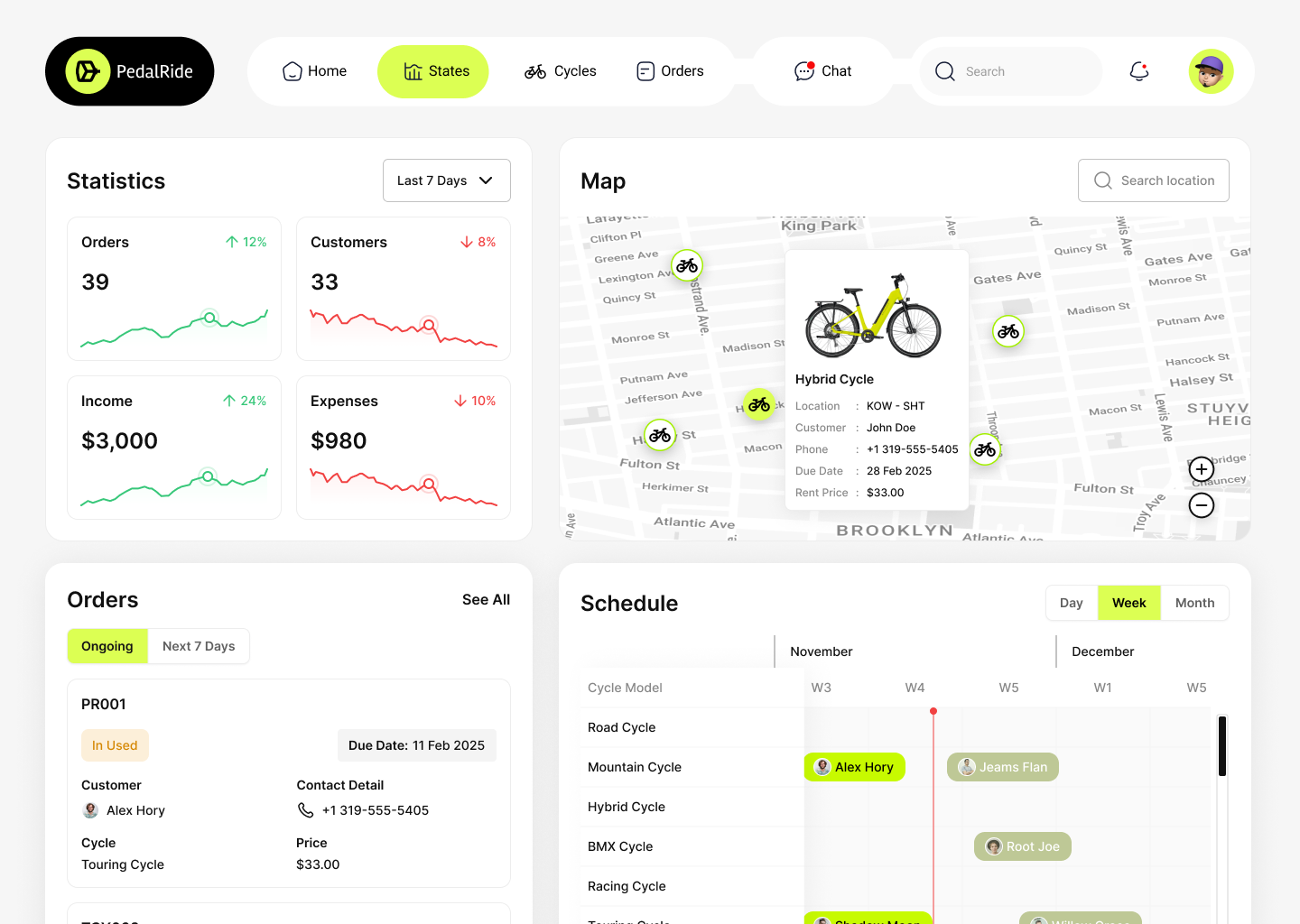
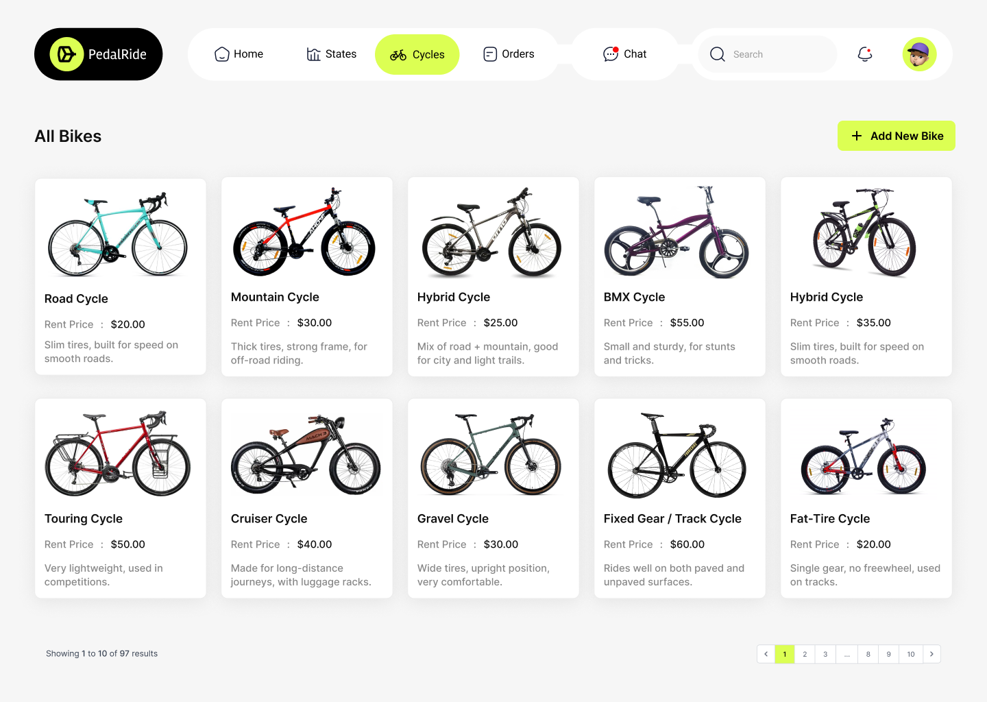
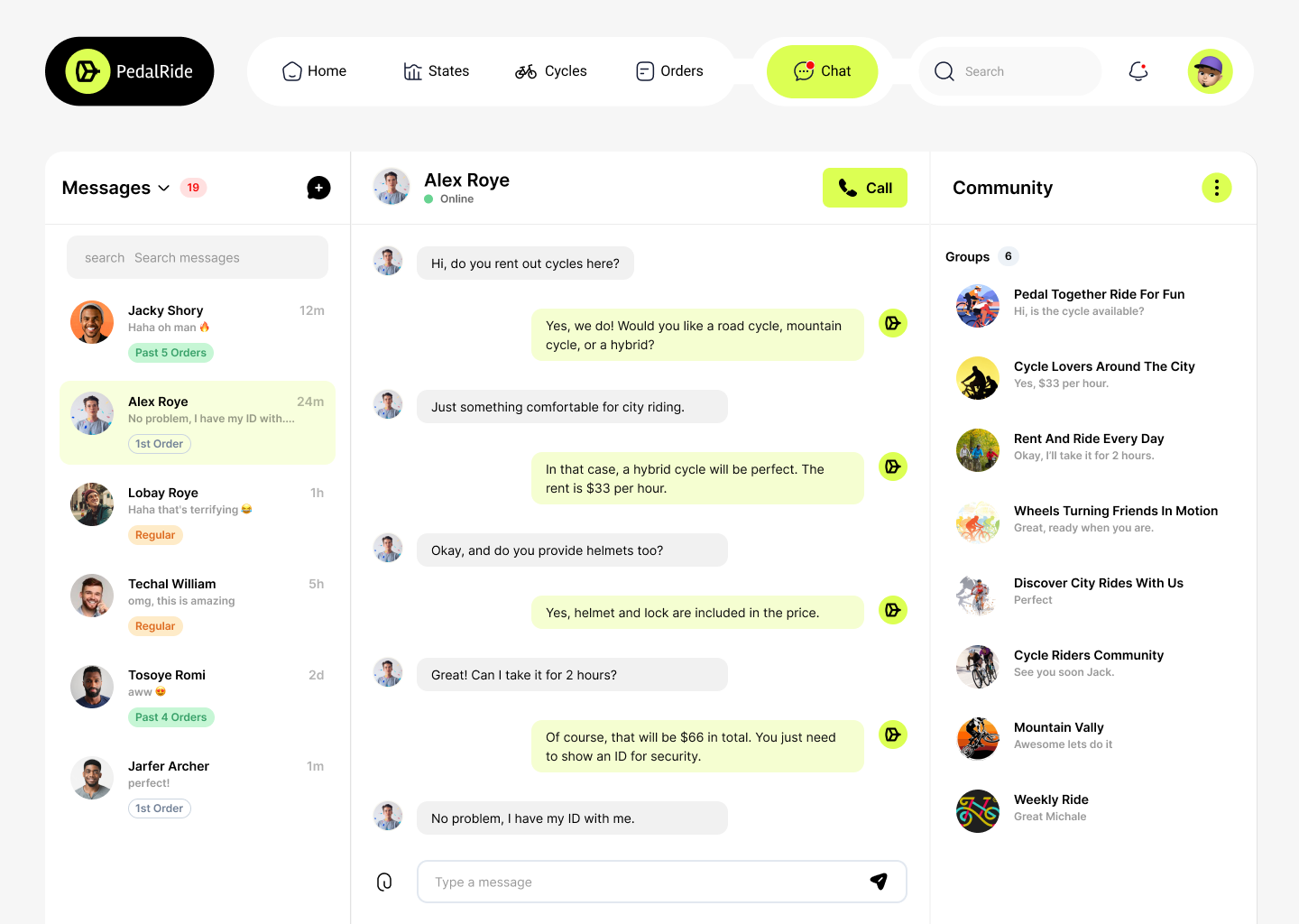
Web App & SaaS

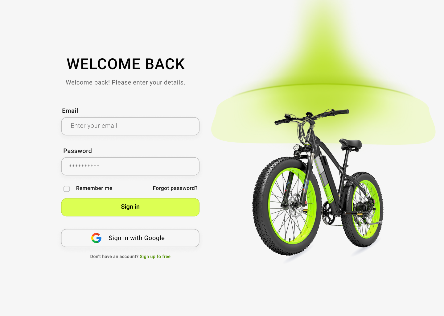
Landing Page


Founder of Pedal Ride