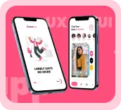


✦ Conducted competitor research (Instagram, VSCO, TikTok, Pinterest).
✦ Mapped user journeys focusing on sharing & discovery.
✦ Designed wireframes → high-fidelity UIs → prototypes.
✦ Iterated through user feedback to refine navigation and interactions.
✦ Competitors had feature-heavy interfaces that distracted from content.
✦ Algorithms often favored popularity over authentic lifestyle sharing.
✦ Limited privacy and personalization.
Swish positioned itself as a lifestyle-first app where aesthetic design, personalization, and authentic storytelling come together.
✦ Designed 70+ wireframes across onboarding, feed, post creation, explore, and messaging.
✦ Usability testing revealed the need for one-tap access to camera and stories.
✦ Iterations focused on clean layouts and fast transitions.
Swish logo blends modern minimalism with social vibrancy, creating a strong identity for a lifestyle-driven social app.
✦ Typography
Bold sans-serif typeface communicates clarity, confidence, and modernity, making the brand approachable yet professional.
✦ Symbol (Š)
Unique icon with a playful accent mark represents expression, individuality, and connection, key traits of a social lifestyle app.
✦ Color (Portland Orange)
Vibrant orange signifies energy, creativity, and enthusiasm, perfectly aligned with the dynamic and engaging nature of a social community platform.
✦ Black Contrast
Deep black balances the energy of orange, adding stability and sophistication to the overall brand personality.
Together, these elements establish Swish as a bold, fun, and trustworthy social app, designed to foster creativity, connection, and self-expression.


Co-Founder of Swish
Website Design
Here to Help 🪶 Innovative Ideas 🪶 Creative Concepts 🪶 Dynamic Layouts 🪶 Ready to Create 🪶 Your Trusted Solo Designer